
“Turning Design Into Value: Doubling The Rent”
As a landlord and founder of Dwelling&Manor, I’ve always believed that property management is more than contracts, compliance, and maintenance. At its core, it’s about presentation, perception, and the lived experience of a home. A property isn’t just a financial asset — it’s a stage where life unfolds, and the way it’s designed and presented directly shapes its value.
With over a decade of professional experience in interior design, I’ve had the privilege of creating both real and virtual environments for a wide range of clients. This background taught me that design is not simply about aesthetics; it’s about strategy. Every choice — from layout to lighting, colour to furniture — influences how a space is perceived and how people connect with it.
Recently, I had the opportunity to put this philosophy into practice. By reimagining the space through strategic interior design and professional photography, I was able to highlight its heritage character while introducing a fresh, contemporary edge. The transformation didn’t just enhance its appeal — it doubled the rental income, proving that thoughtful design and presentation can deliver tangible results.


The Canvas - Hidden Potential
The property in question was underperforming, yet the moment we stepped inside, its potential was undeniable. Built in the 1880s, this Victorian gem belongs to one of Dwelling&Manor’s favourite architectural eras — rich in history, proportion, and detail. But it was clear the building had not been meaningfully renovated since its inception.
Where others might see only neglect or face value, we look for hidden character. That ability to spot potential is what sets us apart. Many buyers would have walked away, but at Dwelling&Manor we understand that every property has a deeper story waiting to be revealed.
This home lacked definition, so we treated it as a blank canvas with heritage restraints — respecting its bones while reimagining its future. By approaching it this way, we could unlock its true personality and transform it into something both authentic and desirable.


Choosing A Design Ethos
Selecting the right design ethos is one of the most important decisions in any restoration or renovation project. A building’s character is not something to be hidden or overwritten—it is a story waiting to be told. The ethos you choose should amplify that story, playing to the building’s strengths rather than masking them. When you embrace the inherent qualities of a space, you elevate its authenticity and create a design that feels both timeless and true.
For our project, we committed to a Victorian design ethos, a choice rooted in the building’s own history. Every decision we made was guided by this principle, from the smallest detail to the overarching aesthetic. By aligning our design with the Victorian spirit, we ensured that the building’s heritage was not only preserved but celebrated.
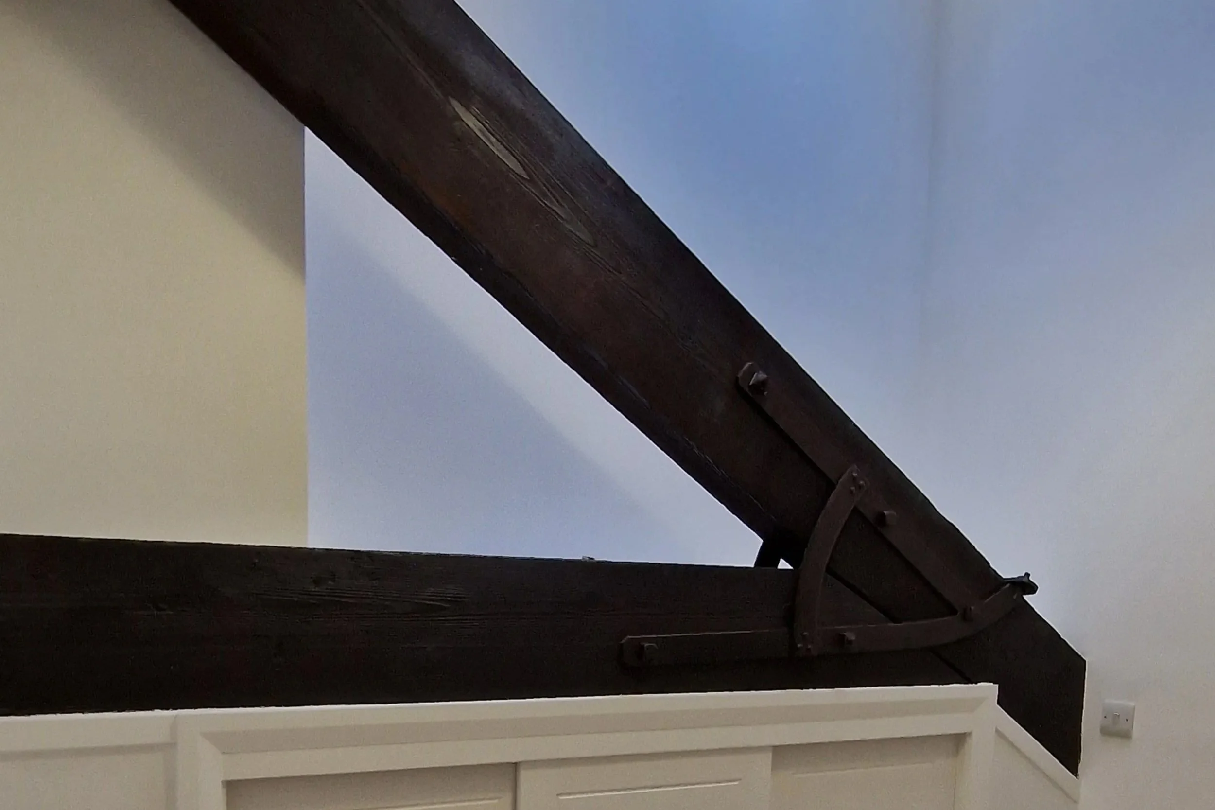
One of the defining features we leaned into was the original wood beams. Rather than concealing them, we highlighted their craftsmanship and warmth, allowing them to become a focal point of the design. These beams carried the weight of history, and by showcasing them, we honored the building’s past while giving it renewed life.
Ultimately, choosing a design ethos is about respect—respect for the building, its history, and its character. When you let those elements guide you, the result is a space that feels authentic, elevated, and deeply connected to its roots.
Balance authenticity with modern needs A design ethos doesn’t mean living in the past. It means using the building’s character as a foundation, then layering in modern functionality and comfort in a way that feels natural.
Let the building speak Instead of forcing a style onto a property, ask what story it wants to tell. A minimalist ethos might suit a mid-century home, while a Victorian ethos elevates a heritage property with rich detailing.
Layout - Heart of the home
When approaching the layout of a home, the key is to let the architecture guide you. Every building has natural focal points — spaces that draw the eye and invite gathering. By aligning the layout with those strengths, you create flow, balance, and a sense of harmony that feels effortless.
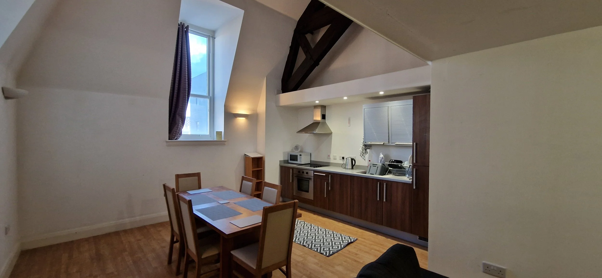
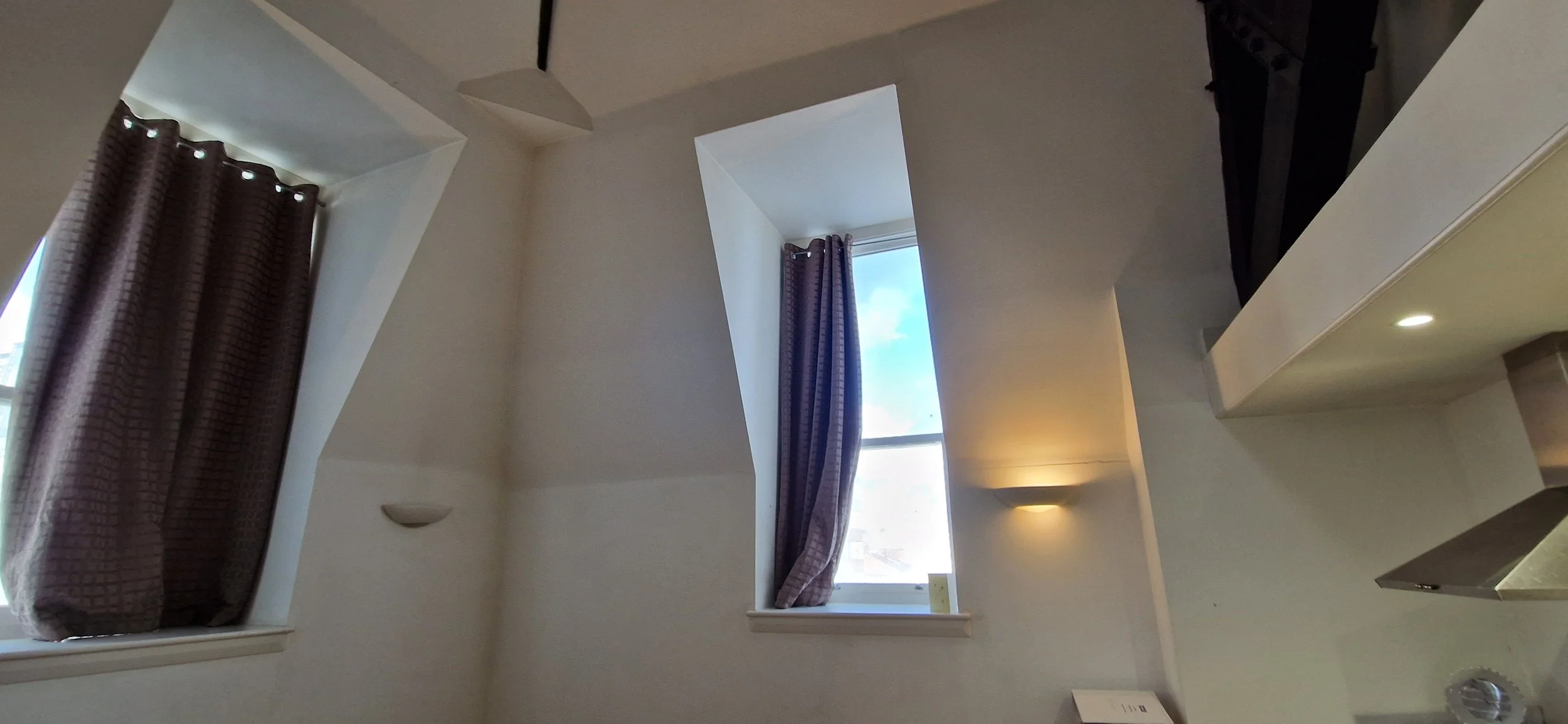
In our project, we made a deliberate choice to place the dining room at the heart of the home. This wasn’t just a stylistic decision; it was a response to the building’s most striking feature — a ceiling that rises two stories high. The verticality of this space naturally commands attention, and we wanted to honor that by making it the central hub of the house.
The dining room became the anchor, overlooked by a bedroom veranda that adds both intimacy and grandeur. This interplay between openness and connection allows the dining room to feel expansive yet deeply tied to the rest of the home. It’s a space where family and guests can gather, while the architectural drama of the double-height ceiling elevates everyday moments into something memorable.
From there, we designated the surrounding spaces with intention:
Living areas were placed to flow naturally from the dining room, ensuring that social spaces remain interconnected.
Bedrooms were positioned to benefit from privacy while still maintaining a visual relationship with the central dining hall, especially through the veranda.
Circulation paths were designed to emphasize the dining room’s role as the focal point, guiding movement through the house in a way that feels organic.
By letting the building’s strengths dictate the layout, we created a home that feels both functional and poetic. The soaring ceiling and exposed vantage point became not just architectural features, but the very soul of the design.
“Stepping into the home, the journey naturally leads toward the dining room, which we designated as the focal point. The moment you enter, the eye is drawn upward — the ceiling soars two stories high, creating a sense of grandeur and openness. This vertical drama sets the tone for the entire house.”
Colours - Playing On Harmony
Colour choices are never just aesthetic — they are structural decisions that shape how a space feels and functions. The palette you choose must respect the building’s inherent strengths, elevating what is already there rather than fighting against it.
In our case, the starting point was obvious: the dark wood beams. These beams, rich with natural grain and marked with scribbles from the original installers 150 years ago, were far too beautiful to cover or paint. They carried history, character, and warmth, and we knew they had to remain the defining feature
With that in mind, our primary colour became black. Black provided a strong, grounding base that harmonised with the depth of the wood, creating a cohesive and dramatic backdrop.
The next step was choosing a secondary colour to complement this foundation. We narrowed it down to two options:
Bright navy blue — bold, sophisticated, and able to add vibrancy without clashing.
Olive green — earthy, calming, and naturally aligned with the timber tones.
Both worked beautifully, but ultimately we chose navy blue. It offered a striking contrast that elevated the richness of the beams while maintaining elegance.
Finally, our tertiary colour was gold. Gold accents brought warmth and a sense of refinement, tying the palette together with subtle highlights that catch the eye without overwhelming the space.

Colour Theory in Action
The colour wheel and basic principles of colour theory guided our decisions:
Contrast and harmony: Dark wood and black create depth, while navy introduces vibrancy. Gold acts as a highlight, ensuring balance.
Complementary tones: Navy blue sits opposite warm wood tones on the wheel, creating a dynamic yet harmonious pairing.
Hierarchy of colours: By designating primary, secondary, and tertiary colours, we established a clear visual rhythm that avoids clutter.
Why Colour Choices Matter
Colour defines mood, flow, and perception. The wrong palette can flatten a building’s character, while the right one amplifies it. By working with the strengths we had — the beams, the history, the natural richness — we created a scheme that feels authentic and elevated.
The lesson is simple: listen to the building. Its materials, history, and quirks will often tell you which colours belong. When you respect those cues, the result is timeless.

Furniture: Balancing Form and Fit
Choosing the right furniture is one of the most critical steps in shaping a home’s atmosphere. While aesthetics matter, size and proportion are far more important than looks alone. A piece that overwhelms a room or feels cramped within it will never achieve harmony, no matter how beautiful it may be. Furniture must fit the space — physically and visually — to allow the architecture and design ethos to shine.
For our project, we took this principle to heart. We commissioned custom beds designed to fit the heritage style of the property, ensuring they complemented the proportions of the rooms rather than competing with them. Beyond the beds, every piece of furniture was chosen with a classic contemporary look, accented by subtle Art Deco flairs. This blend created a dialogue between past and present: timeless elegance with just enough modern freshness to keep the building feeling current.
The result is a scheme that perfectly complements the Victorian ethos we carried throughout the design. The furniture doesn’t just fill the rooms — it enhances them, continuing the traditional narrative while adding layers of sophistication and modernity.
Ultimately, furniture is not decoration; it is architecture in miniature. When chosen thoughtfully, it anchors the design, respects the building’s strengths, and elevates the entire living experience.
Lighting: Shaping Atmosphere and Highlighting Character
Lighting is one of the most powerful tools in design. It doesn’t just illuminate a room — it defines mood, draws attention to architectural features, and creates a rhythm between spaces. The right lighting can elevate a building’s strengths, while the wrong choices can flatten its character.
For our project, we treated lighting as both functional and expressive. The two‑story dining room ceiling became a natural showcase, so we used statement fixtures to emphasize its height and grandeur. This not only highlighted the vertical drama but also anchored the dining room as the focal point of the home.
Elsewhere, we layered lighting to suit each space:
Ambient lighting for warmth and everyday comfort.
Task lighting in practical areas like kitchens and bedrooms, ensuring usability without compromising style.
Accent lighting to highlight the original wood beams and architectural details, allowing their history and texture to shine.
Our choices leaned into a classic contemporary style with subtle Art Deco influences, echoing the furniture and colour palette. This blend complemented the Victorian ethos while keeping the building fresh and modern.
Why Lighting Matters:
Scale and proportion: Fixtures must suit the room’s dimensions — oversized chandeliers overwhelm small spaces, while understated fittings disappear in grand rooms.
Tone and colour temperature: Warm light enhances wood and heritage features, while cooler tones can feel stark.
Layering: Combining ambient, task, and accent lighting creates depth and flexibility.
Ultimately, lighting is about storytelling. It guides the eye, sets the mood, and ensures that every design decision — from colours to furniture — is seen in its best light.


Art & Accessories: The Power of Finishing Touches
Design isn’t complete until the final layer is added — the art, accessories, and small details that bring personality and cohesion to a space. These finishing touches are what transform a house from simply well‑designed into something memorable, lived‑in, and full of character.
Accessories have the power to tie together the larger design ethos. They echo the colours, complement the furniture, and highlight the architecture, but they also introduce individuality. A carefully chosen piece of art or a distinctive accessory can become the soul of a room, sparking conversation and leaving a lasting impression.
For me, this stage has become something of a signature. I always like to add a character animal statue — a playful yet elegant nod to personality within heritage spaces. In this project, that signature took the form of the now‑famous monkey light. Perched with charm and holding its lamp aloft, it became both functional and whimsical, a reminder that design should never lose its sense of joy.
To root it in the Dwelling&Manor ethos, we gave the monkey a name: “Monty” Inspired by the blend of heritage and imagination that defines our approach, Manorick now stands as a symbol of how tradition and creativity can coexist.
Why Accessories Matter
They complete the story: Accessories are the punctuation marks of design, reinforcing the narrative you’ve built.
They add personality: A statue, a lamp, or a painting can embody the character of the space.
They balance formality with playfulness: Especially in heritage properties, small touches prevent the design from feeling too rigid.
They create memory: Guests often remember the quirky accessory or striking artwork long after they’ve left.
Ultimately, art and accessories are the finishing notes of a symphony. They don’t overwhelm the design but elevate it, ensuring that every space feels intentional, personal, and complete.


The result? A space that felt not just liveable, but desirable.


Conclusion: Design as Strategy and Story
Every property tells a story — through its architecture, its materials, and its history. The role of design is not to overwrite that story, but to amplify it. By respecting the building’s strengths — the beams, the proportions, the light — and layering them with thoughtful choices in layout, colour, furniture, and accessories, we created a home that feels both timeless and fresh.
This project proved what I’ve always believed: property management is more than compliance and contracts. It is about presentation, perception, and the resonance of a space. When design is treated as strategy, it doesn’t just elevate aesthetics — it elevates value. In our case, it doubled the rental income SND created a home that tenants connect with and remember.
Why Professional Photography Is Non-Negotiable
Once the design was complete, it’s now about it’s presentation. This is key when marketing your property. This wasn’t just about taking pictures — it was about capturing atmosphere:
Lighting mastery: Professional photographers understand how to showcase natural light and highlight architectural features.
storytelling: Great photography invites prospective tenants to imagine their lives in the space.
Marketing impact: Listings with high-quality visuals consistently outperform those with amateur shots — they attract more views, more inquiries, and better tenants.
We Can Do This For Your Property
At Dwelling&Manor, we don’t just design for ourselves — we bring the same philosophy and expertise to our clients. Every property has untapped potential, and our role is to uncover it. Whether it’s a heritage home with beams that deserve to shine, or a modern apartment that needs personality, we know how to transform spaces into experiences.
Our approach is simple but powerful:
Listen to the building — respect its history, proportions, and strengths.
Craft a design ethos — align layout, colours, furniture, and lighting into one cohesive story.
Elevate with finishing touches — art, accessories, and signature details that make the space unforgettable.
Present it professionally — through photography and styling that capture not just the look, but the feeling.
The result isn’t just a more beautiful property — it’s a more valuable one. As our own projects have shown, strategic design and presentation can dramatically increase rental income and tenant appeal.
If you’re a landlord, homeowner, or investor, Dwelling&Manor can help you achieve the same transformation. We blend heritage with innovation, tradition with modernity, and always finish with character. Because when design is done with care, your property doesn’t just stand out — it thrives.